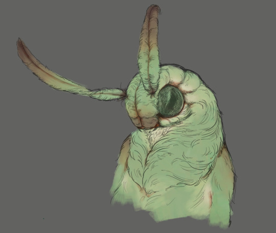
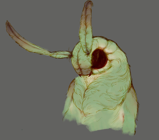
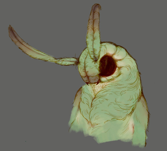
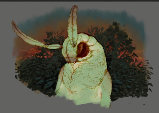
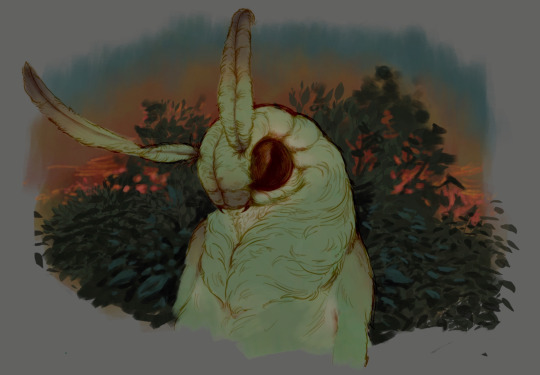
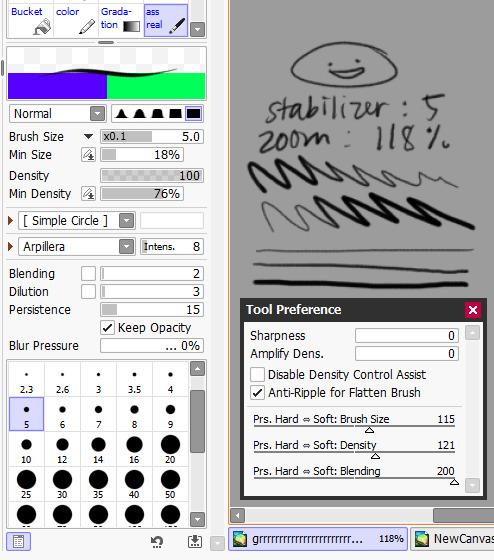
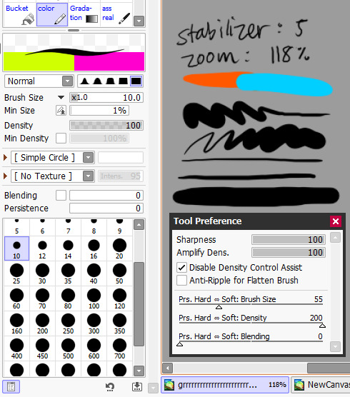
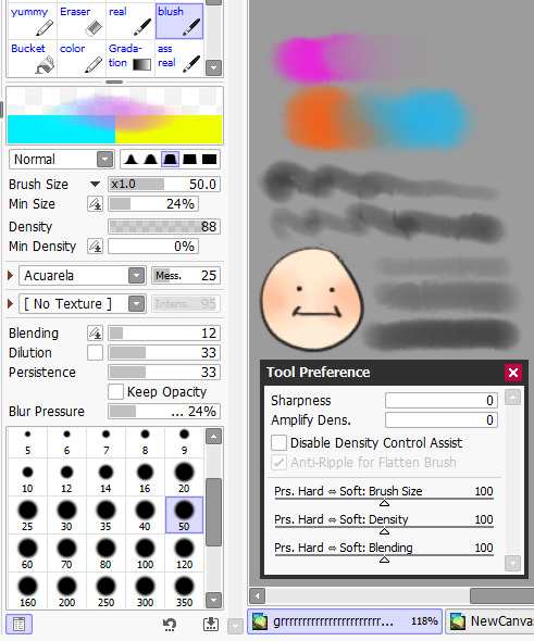
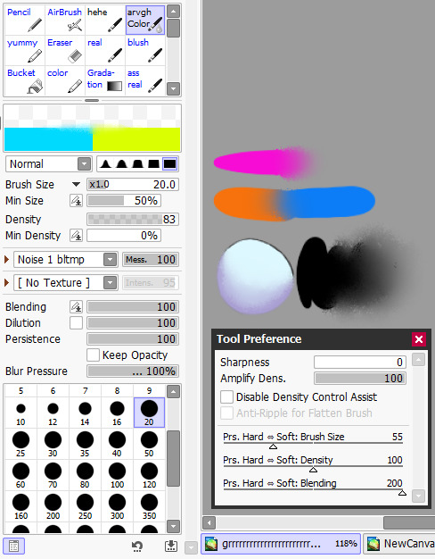
#I like how I can make the blending brush be anything on procreate
Explore tagged Tumblr posts
Visit Tumblr Blog
Explore Tumblr blogs with no restrictions, modern design and the best experience.
Last Seen Tumblr Blogs


Fun Fact
Tumblr was named as a finalist in Lead411’s New York City Hot 125 in Aug 2010.
Text
Someone asked me a question earlier, but it wouldn’t let me respond to it so I’ll try my best to sum up some of the things they asked me. they asked me about my comic making process. I should be honest I’m almost a complete amateur. I wanna say I’m self-taught, but that’s not to take away from all of the YouTube videos and tutorials that I’ve watched online. Somehow I just ended up putting them together and into what I have now.
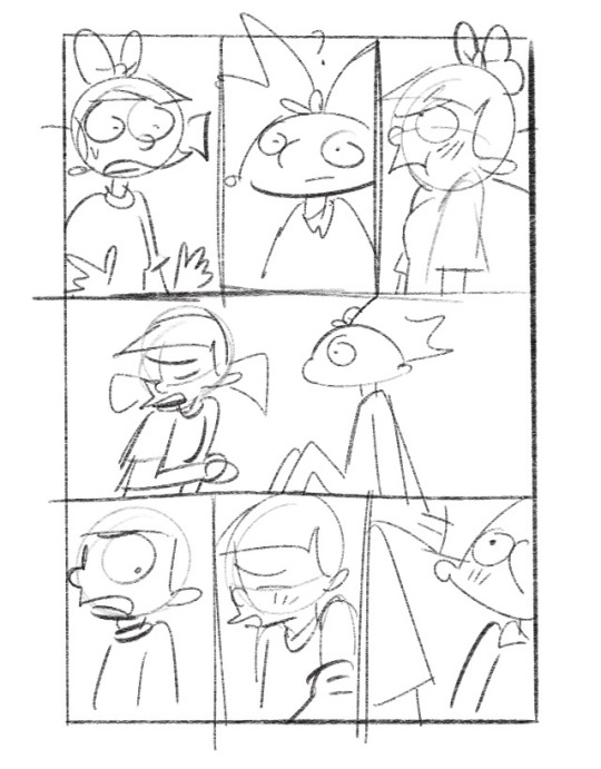
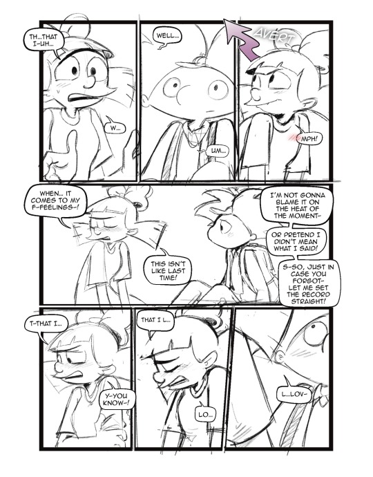
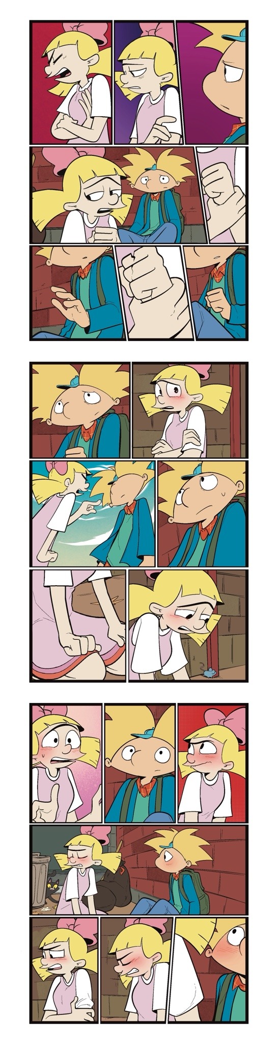
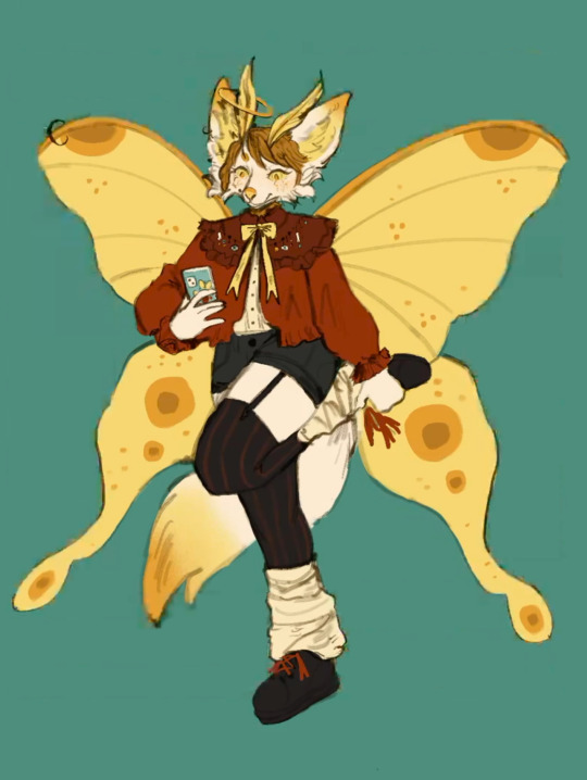
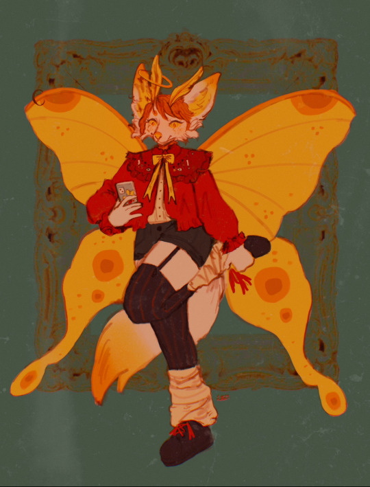
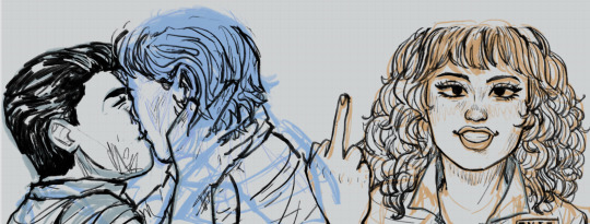
To start off with I almost always try to write my script first. after the script, what’s most important to me is the expressions on the characters faces. I think more than anything that gives me the best direction to my writing. As you can see with my first image, sometimes it can be as simple as just drawing stick figures this just gives me a directional idea of how my paneling’s gonna look. I’d say on average. I do up to three drafts the first draft direction. The second draft is a better idea of that direction and the third draft is all the cleanup so it’s ready for line art 
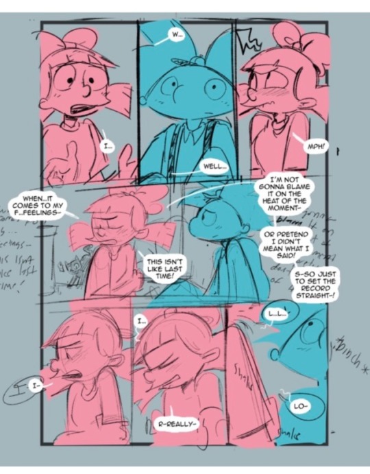
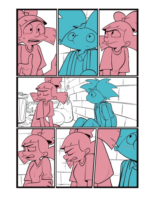
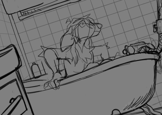
I usually separate my characters by specific color. This is so when I go into color, it’s easier to see which characters need what.
You can call me a bit of a cheater, but I like to use closed lines when I draw my characters. that way I can use a reference layer to just fill in the colors instead of having to do it manually or using my magic wand tool. 
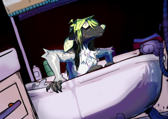
I also utilize the pallets on Procreate to pick their colors
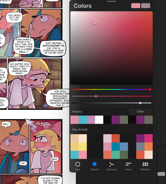
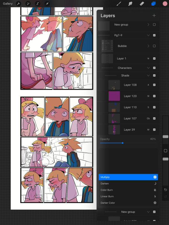
When it comes to shading, I like to use multiplayer layers and erase out the lighting. I might use some ambient lighting here and there with a dark pinkish purple this is going to depend on where your scene is taking place, but since mine is an alleyway, my multiplayer layer is at 40 opacity. For the characters, I usually use my syrup brush to blend in some of the less harsh shades. When it comes to my backgrounds, I like to use my glowing brush to erase out the lighting.
I still myself have a hard time drawing backgrounds I struggle to find where to put my characters in place some people find it easier to draw the background first and then the characters and although I do agree, that’s easier to establish the shot, I need focus on my characters. So what I usually do is draw my characters in a box and then draw that box in a space and that space becomes my background.
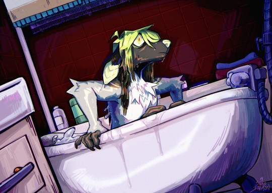
 I play around a lot with the Procreate effects that they have I use a pen called, burst for dramatic feelings, like a burst of energy or a burst of emotions I might use a comic dotted layer for something more comedic or action based. 
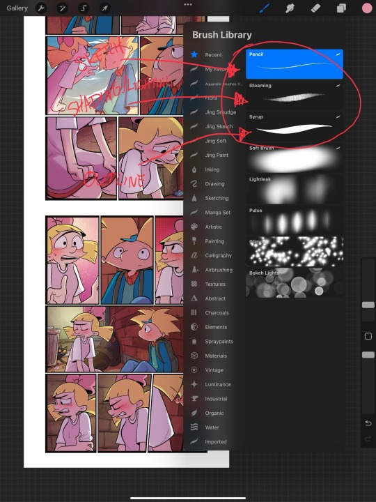
When it comes to brushes, I use a pencil for the sketch, a gloaming for the shading and syrup for the outline. Those are the main pens I use and everything else is effects. 
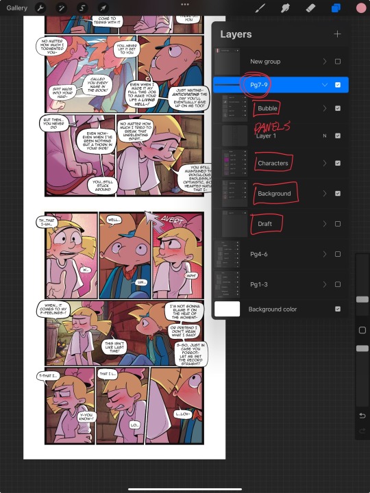
My organization isn’t always the best either, but this is how I usually do it. Panels and bubbles are at top, including the special effects like for example if I were to write the word ‘shake’ If Helga was shaking or blush, if Arnold was blushing, this would be in the bubble layer.  under that would be panels under that would be characters and in that folder I would have line art, then lighting and shading then color and that follows the same formula for background. 
This is a general breakdown of what I do in my comic, and I couldn’t say at all, but I hope it gives you an idea of what I do. again I’m no professional and you should take all my advice with a grain of salt. My best advice is learned by doing I think if you looked at my first chapter and saw my latest chapter, you’ll see my improvement and my paneling in my expressions in my establishing shots and in my color shading. So if you wanna make a comic, just make it and learn as you go, your first one isn’t gonna be a banger more than likely but it’ll be the best learning experience, in my opinion. If you guys have any questions, I am an open book! Feel free to ask me anything.I stream on my TikTok when I make my comics so if you want to watch the process, you’re more than welcome to tune into that but I’m not gonna lie. It’s a bit tedious to watch 😂 I’m @eden_fries on most platforms.  
#arnold x helga#helga pataki#hey arnold#web comic#helga g pataki#fanart#comic#my art#fan comic#my comic#the process
72 notes
·
View notes
Text
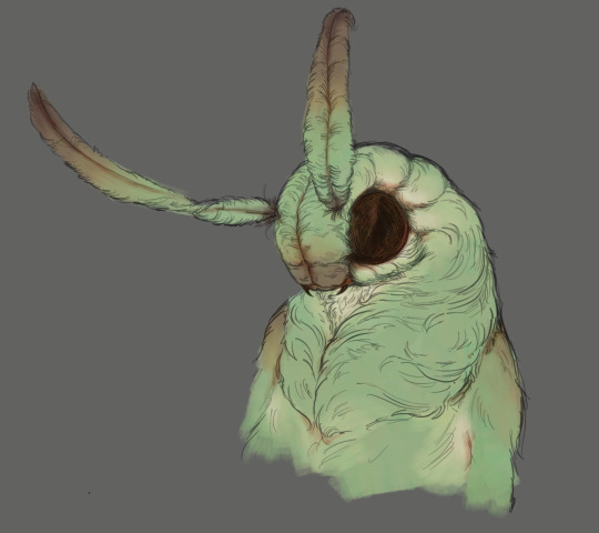
Coloring tutorial I guess
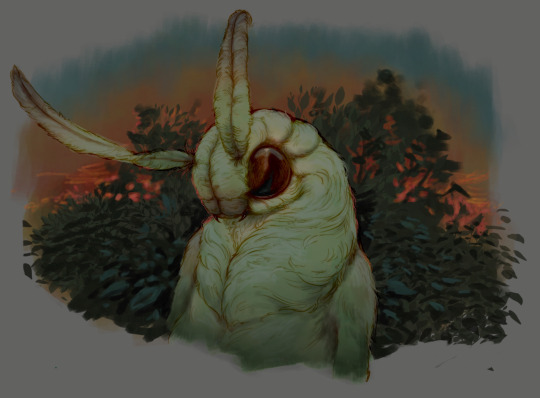
That's my most default shading style, a hybrid of line drawing and painted shadows, and I'll tell you exactly how to get this look. But before we start, you need a weapon This is my main brush for basically anything, including line art on days when I don't feel like switching to something actually intended for inking. It's a lightly textured square brush with color variation on every stamp. Intended for Procreate but you can always just rip the alpha texture out of the file and use it for a brush in any drawing program. That out of the way, let's go. I'll use the same line art as the one in fluff tutorial. Set the line layer to ~60 or so opacity and get to blocking in the base colors of your character. The jitter brush will introduce some color variation on it's own, but changing the color occasionally will add more visual interest.
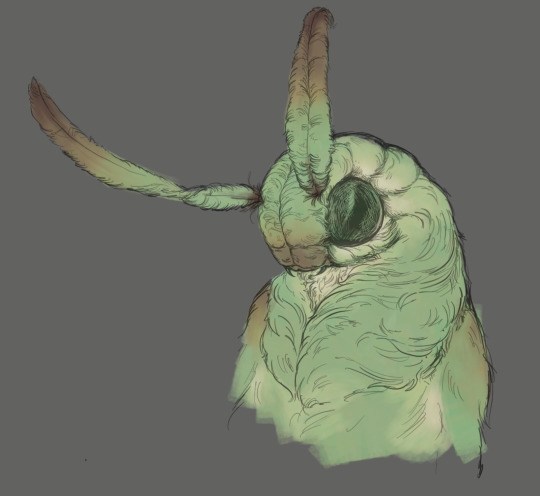
After this I add a multiply layer on top and dab orange or red in places where we might be able to see the base of the hairs or peek at the carapace underneath.
It's places where hair parts and where it's shorter. This accent color works great on joints as well. Example of the thing I'm going for in real life:
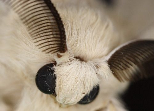
Especially visible behind the head. It's not present on every moth to be fair, but I like to add these accents even where it wouldn't make sense, just because it looks nice. Even on insects without hair. Block in the eyes and mandibles now, best if it's on separate layer.
Now, the actual funny tricks begin. If you're one of the people who only use multiply or add blend modes, stop it, get some help Understanding the math behind blend modes is gonna get you a long way. My lineart is set to subtract more often than not. I find it produces juicier and more colorful results than multiply. I want to give this picture a warm orange feeling, so the color of my lines should be the opposite - blue.
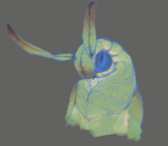
And, subtract.
Perfect, but not quite. We can push the lines to an even softer feeling. Take the line layer, copy it, invert the color and set to multiply. I then throw gaussian blur on the resulting copy and reduce opacity until the lines bleed into the surroundings just a little bit.
On to actual shading. People who shade without getting in some background first scare me, so let me throw something together real quick.
A simple gradient will also suffice for this use. We just need some information on which colors are present in the surroundings. Copy your background, bring it on top of your character layers and gaussian blur it real hard. Set it to multiply, remove all parts of the layer that go beyond the pixels of the base color layer. Adjust opacity until the character fits in the background.
Let's identify the light sources. In this case it's only the sky, but it produces two distinct colors - soft blue lighting comes from the top, slightly stronger red comes from behind. The blue light I set to exclusion blend mode because it felt most appropriate in this case. Both add and screen looked too strong to be the light coming from such dark sky.
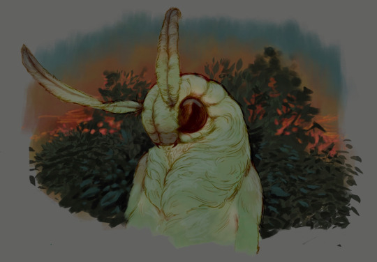
In this lighting context the lower part of the body will receive less light that the upper part. I use the green of the bushes set to multiply to darken the bottom.
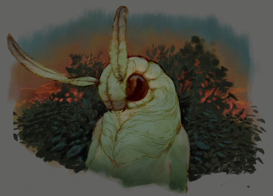
The character is surrounded by all kinds of soft light, but it can't get everywhere. It's time to add ambient occlusion, or contact shadows, for those without a 3d background. Anywhere where there is a crevice or surfaces almost touch, a soft shadow will form.
I do it on a multiply layer with a neutral gray-green color. Gray because any color light isn't really getting in there and green because the fluff is somewhat transparent and whatever light does pass through it gains a greenish hue.
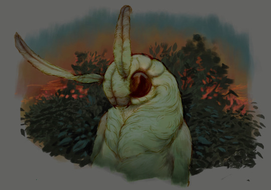
Last step, red rim light from the fading sunset behind the character.
Since it's rim light I just work with normal blending mode. Setting it to add or something of the sort would make the rim light brighter than the source of the light. And it'd be odd.
And that's it. I usually throw on some post processing in Snapseed. Pull some curves, throw on a bit of grain, etc. But it's a topic for another time.
In conclusion, try to think about the environment more when shading. What route does light go through to reach where you're coloring? Did it reflect off of any colored surface? Did it pass through something transparent to gain a different hue? What color shadow would this ambient lighting produce? Go have fun with your colors now.
260 notes
·
View notes
Note
hi i love your work! i wanted to know how you go from grey scale to color? i want to try it myself
yes yes ofc!! im a commercial illustrator so i have a very specific process for speed/efficiency and to also make it easier to revise if need be so the process isn't very "fun" (fun for me is like mixing paint and applying it slowly lmao) but it is how i do it lol. this is gonna get long so beware!
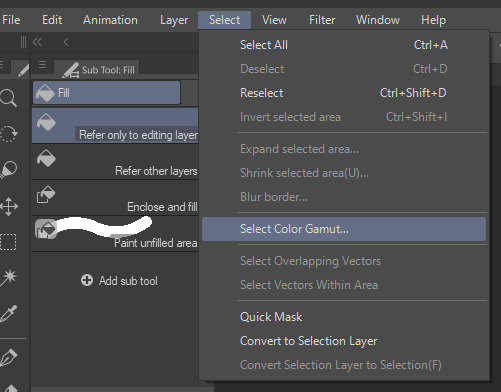
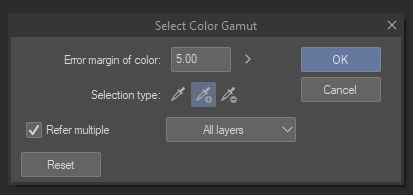
so my usual process for digital work is always b&w shapes > color > finalize. i use something called 'select color range' (photoshop)/'select color gamut' (clip studio paint) plus tons of layers w different blending modes to get the colors i want. this works in procreate/krita/any other program as well so long as there are layers/blending modes! also, even if there isnt select color range, this process can still work, just the clean up afterwards will take longer. how you use select color range/gamut is like this: you pull it up and it will give you a eyedropper tool with a little window. for CSP it looks like this. you can select a color on your canvas and the program will isolate/marquee all the colors that match/are close to the one you selected. you can change the "error margin of color" to include a higher range of colors/values or a lower range. 1 being very specific (it will only isolate the color you selected) and higher numbers being very broad (for example, if you put 20 and select a red, almost all reds and maybe even some oranges/yellows that are the same value will get selected)
so because of this, another thing is that i tend to only work with a round hard brush with no anti-aliasing which makes it incredibly easy to select entire chunks of value and paint bucket it without the horrible grey-halo. in PS i dont believe there is this option but can be mimicked via the dissolve brush (but PS tends to have better color tech so it's not a huge issue)
OKAY SO im using this crop of an old vash piece as an example. i did this in like 5 minutes (goes to show how quick it can be!!)
i tend to always make sure my piece in BW is somewhat developed and clean. usually all lighting/value/comp/drawing problems should be solved so that once u get to color u can just focus on making it look nice lol. the level of development/refinement is honestly up to you, but i find that w this method, the more refined the better

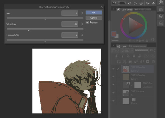
usually i start with a base color on overlay. i try to think abt the overall warmth/hue of the image and select a base color based on that. so like if i want a super warm yellow sunset ill prob choose a neutral yellow. if i want a crazy neon green night scene may go for a neutral green/blue tone.
i would kinda recommend that u have an idea of how the color scheme is gonna be or else u are gonna be in indecision hell and sliding the hue sliders around for hours... but also fuck it who cares we ball


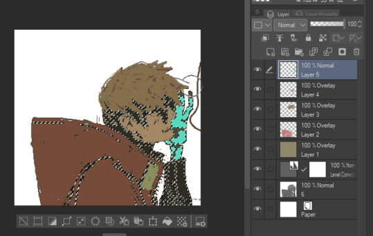
select color range - so here i start selecting entire groups of values and depositing color down. with simple images like this its pretty straight forward, but with more complicated images (like ones with bg, multiple light sources, etc) usually i start with the shadows en masse, and then the lights en masse, and then will start getting more into individual objects. if u dont have this function you can also just paint directly on with the pen or pencil brush
i also abuse the hue/saturation slider lol. this way i can kinda get the exact color i want depending on the blending mode (i use them all. literally. i use overlay the most but my fav is subtract and darken lmao) i literally just do this with all the values on the canvas or until im like. happy with it lol i tend to paint bucket everything but if i need like very specific areas and the marquee has selected areas i DONT want i just mouse/pen it in

after doing all that you can start to like tint/change color with like entire layers of overlay or anything! color balance or anything! (i used a dark purple subtract to tint everything a bit more green, and then put down a pure white on normal on the BG)
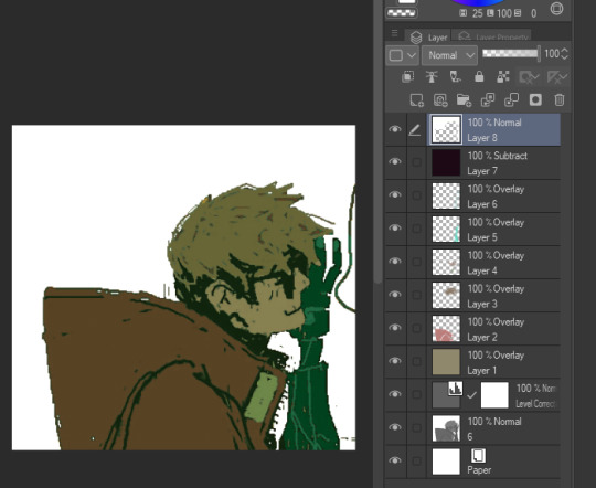
i will say tho that this process is not perfect, and sometimes i will have to go back in and repaint/recolor certain areas to make it look better, but i use this method really just to quickly apply color to the entire image, and then make the adjustments i need later. anyway i hope this was informative in some way LMAO hope it makes sense and that you can find a way to maybe use it for ur own work :D
25 notes
·
View notes
Note
Hello! I saw you were taking asks about anything (with bonus pictures of Mr. Haku?? bless) so I was wondering if I could politely pick your brain about your illustrative process. I've been tearing my hair out over rendering practice lately and your studies always blow me away. I know you've had some training and I think we both use Procreate, so I'd love to hear about how you use layers and/or layer blend modes, but also general process, thoughts, tips, etc. hope you're well, have a nice day :-)
Thank you so much for the ask and kind words!
I don’t cross promote it as much as I should probably but I upload a lot of speedpaints to YouTube, such as this study that might be helpful. Depending on how complicated the piece is, I’ll either break it down by putting shapes down (typically darks first) or do a more formal sketch if I don’t think I can easily eyeball it. After the sketch, I do an under painting on a layer below the sketch, set the sketch to multiply and then I render everything on one layer. It really depends on the brushes you use, but I prefer to build opacity slowly with a brush that doesn’t blend, lowering and upping the brushes opacity as I see fit. This creates a more complicated, kind of glowy effect that I think works particularly well for skin rendering.
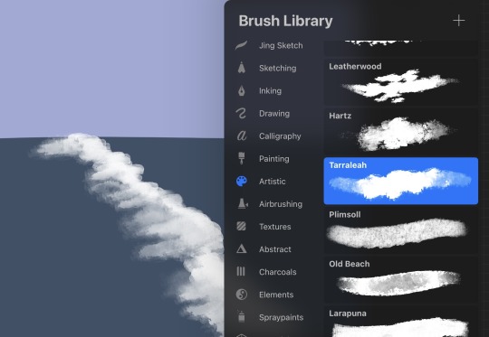
I’ve been exclusively using leatherwood under “artistic” in procreate recently. You have to use a pretty big canvas to make it work (I’m usually working on 8000px+ 300dpi) but I really enjoy some of the unpredictability of the brush, makes things feel more natural. Not sure if I altered the brush at all but if there was a multiply or stabilization on I turn those off always, basically.
As for layer modes, I don’t tend to use them a ton for paintings except maybe for maybe throwing a slight multiply layer to bring tones down if the key gets too high. I’m more likely to mess with curves and color balance to experiment with color. I do this especially for my lined illustrations, I use layer modes also for them too and just go to town trying a bunch of stuff. My tip for this is to duplicate your file, flatten everything, duplicate your flattened layer and just mess with it until it feels right. Color editing to this degree is kind of new to me, but since I’ve begun it’s really upped my game I think.
Before/after color editing. I know sometimes people think of this as a cheating tool in digital art but honestly that is a silly take to me.
I hope this answers some of your more specific questions. Thank you again!
This post is already long as shit so Mr. Haku under the cut
26 notes
·
View notes
Note
i need to know how you learned to do textures in fabric. the way you draw it has so much depth & looks so natural my mind almost skims over it because it looks so right. you do it very masterfully and i was wondering if you learned it from any specific resources, and if you did can you perhaps please share them? obv i know it takes practice too but i think you're a good person to ask. if its ok anyway ^^'
thank you!! it’s mostly a combo of references + brushes! one of the ways i learned to draw was also by watching speedpaints, so that could help too! i’m gonna put more in depth stuff about my process below the cut but honestly this tutorial is one of the ones that has always stuck with me ever since seeing it:
also, i use the procreate default 6B pencil and default ink bleed brushes for nearly everything, but don’t be afraid to use other brushes as needed! i also use the smudge tool to blend.

one of the things i try to focus on is the light source of the image, which really helps me figure out how the light is gonna bounce off the cloth.

pebbles is illuminated only by the light of the pearl, so i find the points where his coat bunches to highlight. his coat is very structured, like a starched type fabric, so the lighting isn’t smudged or anything to make it look more “harsh”. if it was like, silk or satin, i’d have smudged/blurred it.
the thickness of fabric is also really important:


wind’s robes are a satin material, which reflects light in a sorta blurry way, so i just straight up used gaussian blur on it lol. satin/silk also tends to reflect white, rather than the color of the fabric. meanwhile, sliver’s robes are a thicker material so i used the good ol 6B pencil brush (as well as the smudge tool with the same brush) to keep a little bit of the pencil’s “grain” on it, to make the fabric look matte and therefore thicker.


also line work really can help sell the illusion of texture. adding lots of lines n shit at “pinch points” (where there’s a bend) will often make the fabric look thinner than if there’s less lines. sig’s lab coat is clearly a lot thinner than the stiff fabric of piper’s sweater.

variation can help a lot too! moon’s main cloak is a stiffer, matte material while the ribbon and sleeves are more silky and reflective, and the difference between the two can bring attention to the textures.
but yeah. i hope this helped a little bit at least, im not super great at explaining this kinda stuff! i added a sped up video of me doing sig’s lab coat if that’ll help too!
12 notes
·
View notes
Text
The Arcane art style (from the League of Legends animated series) is gorgeous — it's rich, painterly, expressive, and very cinematic.
Here are tips to help you capture that vibe:
1. Focus on Shape and Silhouette First
Arcane characters have strong, clear silhouettes. Their designs are recognizable even in shadow.
When sketching, exaggerate important shapes — Vi’s strong arms, Jinx’s wiry frame, Viktor’s sharp lines, etc.
2. Painterly Textures Over Clean Lines
The show doesn’t use hard "anime-like" outlines — instead, it paints edges with color and value.
After your sketch, paint over your lines and blend them into the forms.
3. Dramatic, Cinematic Lighting
Arcane lives on mood lighting: backlights, rim lights, dappled light through windows.
Think "how would this character be lit in a movie scene?"
Use high contrast lighting to create drama.
4. Rough but Thoughtful Brushstrokes
Arcane art looks a little rough close-up, but the strokes are very intentional.
Use bigger, visible brushes for hair, clothing, and backgrounds, but don't over-blend. Let the brushwork show.
5. Color Palette: Muted, But Punchy Accents
Most backgrounds and outfits are muted earthy tones (grays, browns, dark blues).
Then they pop the characters with vibrant accents — like Jinx’s neon blue hair, Vi’s pink gauntlets.
6. Subtle Facial Expressions
Arcane expressions are extremely realistic and detailed.
Focus on micro-expressions: slight eyebrow lifts, small mouth movements, tension in the jaw or cheeks.
7. Backgrounds: Soft and Detailed at Once
The backgrounds are softly painted, with layered depth.
Focus detail around the midground where characters interact; background details fade out.
8. Mix 2D and 3D Mindsets
Even though it's 2D painted, Arcane was built with 3D models.
Try to build solid volumes with your painting — imagine your characters as 3D sculptures.
9. Master Edge Control
Not all edges are sharp!
Use soft edges for less important areas (like the lower body or background) and sharp edges for the face, hands, or anything you want to draw the eye toward.
10. Study Screenshots
Pick a few screenshots from Arcane, and break them down:
What's the lighting setup?
Where are edges sharp vs soft?
What color palette is used?
How loose or tight are the brushstrokes?
---
Brushes for Arcane Style
You want a painterly set that has texture, variation, and isn't too "perfect."
Here’s what you should look for (or set up):
Sketching Brushes
Pencil-like Brush: Light texture, not too opaque.
Charcoal Brush: For rougher sketches and underpaintings.
Painting Brushes
Chunky Oil Brush: Big, slightly rough, opaque strokes. (Great for hair and clothes.)
Soft Round Brush: For smooth blending where needed (like cheeks or soft fabrics).
Grainy/Texture Brush: To add subtle grit and realism to skin or metal.
Detail Brushes
Fine Brush: Thin strokes for things like wrinkles, scars, or stitching.
Dry Brush: For faded effects, dust, scuffs.
> Programs like Procreate, Photoshop, or Clip Studio Paint usually have these, or you can download free brush packs that say "painterly" or "oil paint" style.
---
Mini Practice Cheat Sheet
Here’s a simple practice plan to start learning Arcane style:
---
Day 1: Shapes and Silhouette
Pick 2 characters (like Vi and Jinx).
Just draw their shadows — focus on big, bold shapes without details.
Goal: Recognize them just by silhouette.
---
Day 2: Lighting Study
Grab a screenshot.
Do a quick grayscale painting (no color!) focusing only on light and shadow.
Goal: Understand how cinematic lighting builds drama.
---
Day 3: Painterly Brushstrokes
Paint an object (a glove, a boot, a bottle) using big brushstrokes.
No tiny blending!
Goal: Let brushstrokes show. Focus on "where do I need detail?"
---
Day 4: Color Palette Study
Pick a scene.
Eyedrop the main colors.
Make a tiny color palette swatch of it.
Then repaint a small area using only those colors.
Goal: Muted base + bold accent colors.
---
Day 5: Face Study (Micro-Expressions!)
Zoom in on a character’s face in a dramatic scene.
Draw just the expression — forehead tension, tiny smile, furrowed brow.
Goal: Subtlety and emotion.
---
Bonus Tip:
Overlay a grainy noise texture (low opacity) over your final painting.
Arcane scenes often have a slight gritty texture that ties it all together and keeps it from looking too "clean."
---
#arcane league of legends#arcane x reader#arcane art#art tips#art style#painting#i don't know if anyone will read this
10 notes
·
View notes
Note
i wanna know how you learned how to render, it's so yum 😞💔
thank you!!! I'm glad u like it. I can try my best to explain my process but its very much a 'feel it with my heart' experience. This is gonna be long and incomprehensible but I'm gonna try:


If we're talking about the (above) garth & baby arthur jr pic or the bloody pete pic, I'd say i started to actually render like that in maybe high school art class (they were much worse then ofc because i have years more practice now)? Obviously my process now is different than it was back then, but before I actually started physically painting canvases with acrylics I usually just did line art and color without the blending-painting pizzazz.
Thats actually where I get my weird random interspersed colors in my coloring as well. Acrylics dry super fast and a high school art class is like 45 minutes so I'd have to totally mix a new pallet the next day. Not that I couldn't color match, but its annoying and having variations with colors or just mixing something up to fill in gaps looks neat if you get it right. If it looks bad just paint over it, but its worth it to try.
My process with these is almost exactly like my non painterly rendered ones, just with steps after. Also, you can get away with a lot when not fully rendering, but when i do render PHOTO REFERENCE is to die for. Specifically for the lighting. I can't emphasize this enough. By the time i'm done with a drawing my search history should be like "knees. Knees sitting. Knee anatomy. Harsh light photography. Curly hair. baby. J. C. Leyendecker new year baby" + 8 pictures of u doing whatever pose you're trying to do.
Anyway, the process for me is usually: vague sketch > carve out the lines/neater sketch > flat colors > basic shading/rendering > color adjusting sketch lines (usually from black to dark red) > collapse everything into one layer & get to WORK
I know the 1 layer thing is scary, but thats life. Its easiest to adjust things that way (for me). No need to worry about layers and blending modes cause its all right there. I usually duplicate the layer the drawing is in before I start on something crazy just to reassure myself that if I fuck it up I can go back. So a lot of the time my layers in procreate are progressively more rendered stages of the piece lol.
Now that Im here trying to explain this im blanking on how to actually express it. Lets see. I can run through some general stuff:
For both of those artworks (baby & pete) they're 100% made with HB pencil on procreate (a default brush! I've never downloaded any new brushes cause im lazy). I actually made a brush explanation for someone a few months ago I can put that right here:


hopefully those are readable. sometimes tumblr flops lmk if my writing is illegible
the eraser tool is your BEST FRIEND!!!! The way I get my lines and shapes and whatnot is by making big ass strokes and then erasing until whatever I'm looking for reveals itself. Here's a video of that process from the aquababy pic. Ignore the jerky pauses lol. also there's the reference photo!:
rendering itself is really hard to describe. Basically just throw color at it until it works out. (just tried to add a video but tumblr says only 1 video allowed


I hope this is helpful somehow! Just threw a ton of stuff at you. If you want anything more or the actual video or smth just let me know!
#this is A LOOOT#but there's gotta be something here thats maybe helpful#hope it makes any semblance of sense#asks#chooeychoco#feel free to dm me too for anything else lol#that goes for chooey and anyone reading this. id like to say im chill riiight 😋#and if dming isnt ur thing the ask box is right there#this post my self destruct w that video. hopefully tumblr powers through and can post it#sorry if this is crazy im crazy#*MAY self destruct. Lordy
26 notes
·
View notes
Note
Hiiii i just saw your Outsiders/Christine art and HOLY SHIT. When i say my jaw was on the floor it was on the floor. I’m a huge Stephen King fan (I’ve only read his books bc to me his books are good enough. I’m not a huge horror movie watcher girlie but i can do thriller/horror books. I have like 8 of his books, including Christine, on my bookshelf) and once again: HOLY SHIT. I can lowkey see the Outsiders trio as the Christine trio. Now whenever i go to reread the book, i can’t view it the same anymore haha. Another Outsiders/Stepehen King art idea for Halloween: 11/22/63. It’s one of my absolute favorite Stephen King novels. And if you haven’t read it, highly recommend it. It’s so intense and entertaining and i do get lost in that book. Anyways, HOLY SHIT. But i was also wondering if you have any tips for beginner digital artists? Like on layers, line art especially, shading etc.? I really want to get into more digital art but my tradional sketches lowkey look better than my digital ones haha. Whenever i see your stevepop or Outsiders art it just gives me a boost of inspiration. And i love them your honor.
Woah, thanks!! I’ll have to check it out- so far I’ve only read Christine and The Body (because my dad’s obsessed w/ Stand By Me), but I really dug both so I’m looking forward to it!
And as for digital art tips, I guess I’d say to keep things loose! I like to use a modified version of the Shale Brush on procreate for my sketches and lineart because it resembles a pencil, and the rough messiness makes it a whole lot easier for me to just relax and draw the way I do on paper. I don’t shy away from messiness especially in digital art- it makes things flow better in a medium that can get really stiff sometimes.
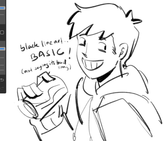
I like to do my sketches in bright colors, and I tend to assign every subject a certain color so I can tell them apart easily (idk how helpful it is, but it works for me!) Then I lower the opacity and draw on a layer on top like this:
Then I turn off the sketch layer and either fill everything in with base colors, or color it in grayscale w/ this Copic marker brush and varying levels of opacity for my comics.
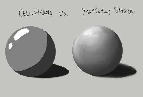
As for shading, I do a combination of cell shading and painterly shading (picture for the uninitiated lol). Both have their merits, and shadows in real life usually include a bit of both.
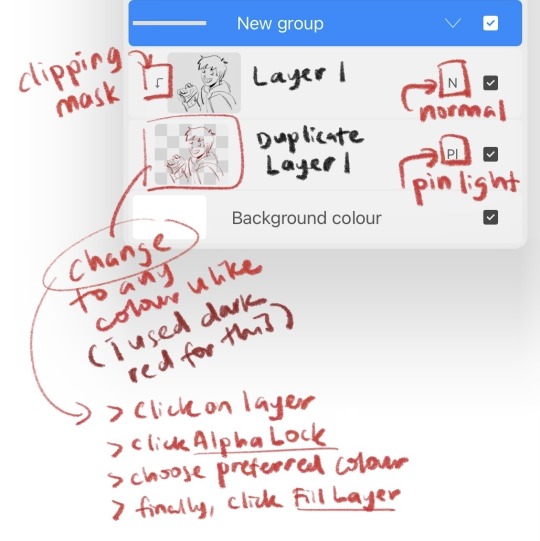
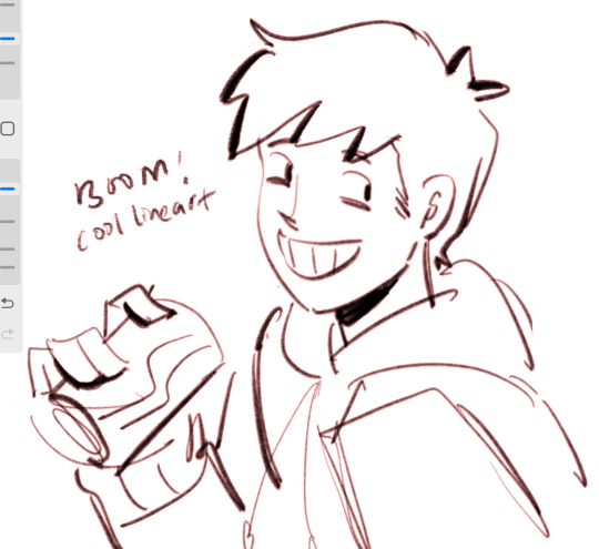
For more simple stuff, I take a shade of either purple or sometimes magenta and cell shade everything with this pencil brush on a multiply layer, usually set to 30-ish% opacity depending on the drawing. Then I’ll blend it out a bit to soften some edges, which is what makes it look painterly. Also if you don’t know, “clipping mask” layers are really helpful for shading! You just put the shading layer over the colors and it stops you from going outside of the colors, it can be super helpful. This method is the one I usually use, and the one I’ve been using since I first started about five years ago now.
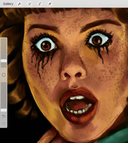
For the Christine poster specifically though I mostly just kept everything to one layer and color dropped from the reference, altering the colors as I saw fit- and just sort of guessed for Evie because she’s way tanner than Leigh and needed her own colors. The only times I used different layers were for each individual character so that they didn’t mess each other up, and also for the sketches, which I put on top of the colors but lightened the opacity on. Idk that I’d recommend this for a beginner tho, it’s taken me years to get comfortable working like this!
Sketch is set to a multiply layer here too. You can’t see it super well here tbh, because of how dark everything is, but oh well. Here’s a study I did last year with the same method tho! (Also she’s got some similarities to Evie huh?? I guess I have a type lol oops)
Anyhow, that’s probably enough for now lol- but lmk if there’s anything else you wanna know! And obviously this is just how I do things, there’s no hard and fast rules for any of this- I’m making it up as I go along, and you should too!!
14 notes
·
View notes
Note
Hey! I love your art so much and was wondering what brushes and/or art programs you use, I'm an artist myself and am just genuinely curious. Sorry if this is a strange ask or anything... I don't use or get on Tumblr too often. Thanks for reading this ask and have a good day/night. (This is my first ask to anyone I think)
hey!!! i use Paint Tool SAI 2!
as of the moment (which means i constantly change it) here is my main doodling/sketching/lineart brush:
my coloring brush: any hard edged basic brush will do, you can also use the bucket tool or the lasso tool, it's simply for coloring
my blushing brush: i blend this brush out by switching to transparency (making it an eraser) and lightly tapping the outside of the paint! (sai users, do this by pressing C on your keyboard. lifesaver been using this shortcut for years) it's versatile, i love using it for gradients
marker brush (usually for ecto): i use this brush only when i want to paint ecto (which i don't do often) but you can use this for other purposes too! it's not my favorite, not even good enough for ecto imo, because my sai 1 version is much better i blend things out the EXACT SAME WAY as the blush brush so please keep that in mind!

a basic brush im testing out for shading purposes: it has a little bit of texture and is made for baaasically cel shading but slightly softer and has the tiniest bit of color mixing

blending brush i barely use and don't actually really like that much: i'm still testing out blending brushes that i like because i can't find one that i like that isn't just blurring colors together or making them muddy when mixed together. if anybody has suggestions, PLEASE let me know! anything like a procreate or csp blending brush that can be recreated would be great
and finally, my rendering brush: it's basically a basic hard edged brush that can pick up the smallest bit of color i use it to clean up and add final touches by using the drop picker often and over the entire artwork

ofc, change anything to your preferences. that's how it goes these are just the settings that work for me :) this also goes for the program LOL i know sai is not for everyone (but it's my baby my bestie my 5ever so like this is about ME)
i have an in-depth post about my CSP brushes and how i work with them (and i don't really ever use csp unless it's a big piece so it's not changing anytime soon) if that's what you have or prefer
my #ref tag is also a treasure trove of my old settings over the years if you'd like to see those too
83 notes
·
View notes
Note
hey egg, hope ur com grind is going well :)
have you ever thought of doing any tutorials? Ur art style is super cute I'm so jealous kskskksskjk
Thank you!! <3 :D Also i get this question alot, and i havent answered bc im unsure how to do a tutorial, but!! I'll try! <3 I'll start with a list of brush packs I personally love! I use Procreate on the ipad :3 *100+ Manga/ComicBook Brush Set for Procreate ($4.99USD) *Ghibli Inspired Brushes 2 for Photoshop and Procreate ($8.80USD) *Sinix Procreate Set (Free) And, not a brush pack, but one of my favourite resources! *3D Posable Skull Ref For sketching/lining, I like to use a square brush! I like the sharper edges :3 I don't really line anything anymore, I prefer cleaning up sketches. While cleaning up, I like to clean up the edges as well, manually adjusting line weight. You'll see what I mean in this speedpaint here! (mild flash warning)
youtube
For my rendering, i block out my shading (i try to use colours complimentary to the bg colours, or one's that compliment the character's colours!) Shading set to Multiply and lighting set to Add or Colour Dodge! And then I use the syrup brush (in the default inking brush set) to do my blending. I can't rlly give any real tips here, I just try to make my brush strokes work with the curves of the pose ^^; I also don't try to clean up my brush strokes, as I prefer the messiness of them :3 I'm still learning more about art, myself, and I frequently try to watch tutorials when I can! I highly encourage artists of any skill level to freshen up with tutorials from time to time! Here's my personal playlist:
My works are incredibly inspired by the following artists, as well! They deserve all the love in the world, and I wouldn't be where I am without them :3 Fivel , Purrmaows , MilkQween , ItaParu , ActuallyRea , TwistCMYK , Lushminda , Moowsie (Jim Davis as well!!)
I'll try to post more in depth stuff regarding my work in the future, like posting speedpaints and progress shots! I hope all this makes sense aaaa :'3 <3
75 notes
·
View notes
Note
Hi! I've just come across your page and am already so obsessed with your art! The lines are all so neat and clean and your sketches alone are just so gorgeous! And the colours you use are all so vibrant and smooth as well; it all comes together in a finished piece that just scratches my brain just right!
I was wondering whether I could ask about your art process, or whether you have a tutorial anywhere? I, for the life of me, am trying to move to digital art on Procreate and I really don't understand anything at all and it's like I've never drawn a day in my life. Your art is so gorgeous and it is inspiring me to keep trying though I'm so overwhelmed, and I'm so in awe of your art that I was wondering if you had a baby step-by-step process posted anywhere of how you make your art pieces?
Thank you so much for your time and I hope you had a lovely weekend ☺️
GHSDFGH Sorry, I'm terrible at explaing things but I'll try the best I can! I found out the best way for me to draw illustrations is drawing small thumbnails first, no details, just overall Idea of what I want (I recommend drawing copule times the same idea, different angles and perspectives). When I'm happy of the results I'm rescaling the thumbnail to normal art size and start adding detail of it, add color, shading and finishing details! Its quite hard to explain what exactly I do since I'm experimenting with different filters and layers every time. iI'm also throwing you some art tips that may be helpful: Procreate tips Thumbnails
Blending modes
I also reccomend watching drawing processes and speeddrawings (thats how Ive learned) and experimenting with procreate on your own, testing different brushes (you can find new ones for free online) and filters!
2 notes
·
View notes
Note
hi, your art style is so cool!! i love it
as a beginner artist, i was wondering if you had any helpful tips for procreate or anything? the art world is kinda daunting lol😅
thank u so much!! ive been feeling down ab my art so seeing this in my inbox was like a sweet treat LMAOO 🎀
so back to the q…. im afraid i dont have any mind blowing tips. its normal to feel overwhelmed as a beginner, but everyone starts somewhere! i say familiarize urself with basic procreate shortcuts (loads of tutorials online) and always play around with their settings! it should be helpful for the learning process along the way.
for eg ermm i used to abuse the gradient maps settings to pretend i know shit ab colouring 😭💀 i still do tbh, except now i understand how it actually works and i can easily get the colours that i want.
some of the things i learned:
1. cool lineart (i always use this as a part of my render process)
2. art is subjective, pick any that you think suits your preference/is fun to use
for brush, do you prefer it round or textured? lots of pressure sensitivity or none? i like my brushes textured and with a good amount of pressure sensitivity. for blending, do you prefer the transition colour to appear smooth or textured/messy? i sometimes mix between both to give a sense of harmony, but i like it textured more. it all comes down to what feels right to you. pick a few artyles that you like and incorporate it into ur own! pretty basic tip but thats the best way that i know. just pretend ur a mad scientist trying to find cure for like cancer or sumn
3. personal opinion: brush type matters
dont listen when someone says the type of brush u use doesnt matter. yes you can draw with any brush. yes all brushes work the same way 🤯🤯🤯. but theres gotta be that ONE brush that just hits the spot for you, as if its made specially for Your Hands….. unfortunately theres no shortcut to finding Your Brush. it took me 4 years of endless experimenting to find mine.
if ur curious on what brushes i use, i have it listed in my carrd. however i still experiment a lot and dont rly bother to update it, but those should be what i use the most/my top favs !
★ ★ ★ ★ ★ ★
i dont think this covers everything, but this is all i could think of from the top of my head. just lots of trials and errors really, and dont be afraid to make a mess!!! i hope this answers ur question :33 all the best!
9 notes
·
View notes
Note
Hi sara! do you have any tips on how to transition from traditional art to digital? I’ve downloaded procreate and have been using it for a few months but i feel like my progress has stunted :,DD any tips or advice would be super helpful if your comfortable!
heya! i'm no expert, but!
be patient with yourself!
try out different brushes! all of them! procreate comes with so many (one of the defaults is my favorite~). if there are artists online you like, see if they mention/link to the brushes they use
(also you can create your own group for brushes, so if you have favorites or brushes you use often, group them together! it makes finding them so much more convenient)
blend modes! one of the great things about layers is being able to use the blend modes to play with color
speaking of color - since this is digital, whatever color you lay down can be changed, so play with colors. fool around with the saturations, either by pumping them up or dimming them down or just move the hue all over the place and see what new color scheme excites you~
if you're using a lot of layers, try minimizing the amount you use, force yourself to commit to your lines/colors/the direction you're going in
make sure your canvas is big enough! if you're drawing in too small a canvas, brushes can look blurry
if you draw only people, maybe try out drawing landscapes or animals - and if you don't draw people, draw people! the point is to draw something different than what you're used to
textures! you can apply texture images onto your art with the blend modes
fuck around!
digital art is great because you can mess up and control-z your way out of a mistake or you can change your colors and completely alter the vibe of your art. if you do line art, you can try out painting without having to spend a bunch of money on paints - lay down those colors on top of your lines. and if you do painting, why not try out some cool inking brushes and see what line-art can offer.
there's so so much you can do with digital art. if you feel like you're in a rut, try something different. a new style. a new brush. pick a bright color scheme. do grey scale! i know that's the go-to advice, but just like draw more, it's true.
i hope this was helpful! if you want anything more specific, i'm here for you~~
8 notes
·
View notes
Note
how much more does csp slap than procreate? wanna know if i should buy it
hmmm i haven't used csp pro as much recently cause of how busy i am, only for achelous's banner and the new references for my ocs, but if you're currently using procreate or any other drawing app that doesn't have a complicated-looking interface, the interface and controls for csp can be difficult to understand. there's kind of a learning curve to get over, i had to look up a youtube tutorial on how to edit the interface to my liking when i first bought it lmfao but the brushes are SUPER nice with all the different textures, and the blending is so interesting to learn how to use since i rarely use the blending/smearing tool in procreate cause i have a difficult time understanding how to use it. the pieces i made so far come out crispy clear on my phone when i send it, which is personally amazing cause i always zoom in and inspect each little detail to see if i missed anything. AND YK HOW IN PROCREATE WHEN YOU BARELY ADJUST THE LINE DURING TRANSFORMING, IT BLURS TO SHIT???? IT DOESN'T REALLY DO THAT AT ALL FOR CSP, THAT SHITS GENUINELY A BLESSING. also i found out how to kinda use the 3d models, so i can do more dynamic poses AND practice my anatomy. genuinely, i really find csp quite an upgrade from procreate due to how many features it contains, BUT i still enjoy using procreate.
i don't have csp on my ipad and as much as i want to for accessibility purposes (i don't have the ability to bring my drawing tablet on me all the time + the wires are a hassle to set up, just imagine setting up in public when you already don't like being in public spaces for a long time, esp with what you draw 😭), you got me immensely fucked up if you think i'm doing a subscription instead of a one and done payment like procreate and csp on my laptop. procreate is mad convenient, i can doodle whatever i want with it, even while taking notes at the same time if i am using it for notes. i use gumroad to find most, if not all my brushes and it's so fun shopping for them like the csp brushes. i'm also super used to how each brush i use works cause i've been using it for nearly 4 years now, and ik how to work around certain elements to my liking, esp the liquify tool cause the liquify tool on csp lags and sometimes does not "listen" to what i'm trying to do with the drawing. i feel like procreate is sorta beginner friendly for digital art, ik other people say otherwise cause it is pretty lackluster compared to other professional digital art programs, but that's just what i think. also i like speedpainting process videos, i just watch them whenever i want to and remember what i was thinking or feeling during a particular moment in it.
all in all, i heavily believe that it's just personal preference on what feels the best and works right for you, because i went through many different drawing apps/prgrams before i finally settled on csp, procreate, and sai (on occasion lol). you also gotta make a heavy financial decision on csp if you're choosing to do either the pro or the ex version, but i'd wait until the discounts come out again if you choose to purchase csp. i think there's the free trial for csp to see if you rock with the interfaces/controls as well before settling on one or the other ‼️‼️
i ain't a big professional or particularly nit-picky on what i think is overall the best, i simply love making art with whatever media i'm using 🙇♂️
0 notes
Text
first, it's already a great start! it looks so cute :3 i have a bunch of tips and tricks, and i broke them down into similar categories. bit of a warning, i'm self taught, so how good/helpful these will be is uncertain
set up
this is all the boring stuff before you actually draw. the main thing is make everything easy to access for you and streamline it, so you can focus more on drawing than fiddling with settings
pen pressure setting: procreate has a universal pressure sensitivity that i recommend playing with until you find what works for you. for example, if you find you struggle with getting darker strokes, move the line a bit to the top left. the default of a linear curve from bottom left to top right works just fine though. for reference, these are my pressure curves (the right one is from a different software)
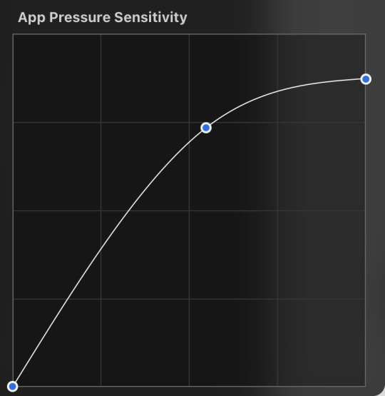
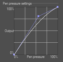
i don't recommend copying mine from the left since it's to make drawing darker without much pressure since i have tendinitis
canvas size and resolution: honestly the "screen size" preset is pretty good for anything. you can also change the canvas size and resolution once you're in, so if you realize you need something bigger or smaller, it's an easy fix. my general rule of thumb is at least 2000px for the smallest dimension and at least 100 dpi. my default is 2480 x 3508px at 300dpi, and i downscale it to about half the size at 72 dpi for posting because the files are too big. if you notice your lines look a bit "jaggy" and it's not from the brush texture, that's pretty good indicator that your resolution/dpi is a bit too low
shortcuts and gestures: highly recommend putting anything you notice you use a lot as a gesture or in the quick menu which i think is tap and hold by default. this can be actions like flipping the canvas horizontally or switching to the eraser brush
brushes: anything goes! try out a bunch and settle on a couple that are your go to's. this also applies to brush settings. tweak settings to your liking! if you didn't already know, you can have preset sizes and opacities on the slider by tap the slider and then the plus icon. if you're lost, there are only three main brushes you'd need for anything: a hard round brush like monoline (caligraphy), a pressure opacity brush like round brush (painting), and a soft airbrush like soft brush (airbrushing). the main reasoning is that you can get the variation for hard and soft edges for anything.
technical tips
these are more for tricks specific to digital art than the "how to draw X" kind
liquify: need to make small adjustments like moving the nose, but you don't want to redraw it? liquify is your best friend! it's under the magic wand/adjustments setting. liquify also works on multiple layers
reference window: under the actions setting and canvas, you can toggle the reference window. by default it shows a small version of your canvas, but you can use it to put a picture to use as reference. very handy when drawing a character! (side note: you can also color pick from your reference by tapping and holding over the reference)
flipping the canvas horizontally: also under the canvas tab is the "flip horizontal" action. it does what it says on the tin. it's benefit is that flipping the entire piece sorta refreshes how you see it. the oddities jump out more since your eyes got used to seeing it in its normal orientation
layer effects and blend modes: by default, every new layer is a normal layer, but you can change it to one of the many different types. there are way better explanations and tutorials explaining what each does, so i'm just gonna go over the ones i use most: multiply: it'll make what's underneath darker using whatever color you use. it's best for applying shadows quickly add: it'll brighten what's underneath with the color you're using. i like using it for bright highlights or lighting, but it's often too strong to my taste, so i lower the layer opacity afterwards overlay: it's kinda like a tint for what's underneath. if you use a blue overlay layer, everything will have a bluish tint to it. i use it to quickly change the setting (sunset, night, etc) and to add the bluish hue to the bottom characters and a yellowish hue to their faces
post processing: these are the fancy effects done at the very end to add the extra cherry on top. all of these are under the adjustments tool. the first four let you change the colors after the fact. again, there are much better explanation than what i can provide, but my go to's are: noise at ~5-8% and for more finished pieces perspective blur and chromatic aberration at ~3-5%. none of these are necessary. i just find them fun to use
foundational tips
these are the general drawing tips not exclusive to digital art
references: references are great! whether it's for poses, outfits, settings, or the character themself, references make drawing much easier
construction: everything can be broken down into simpler shapes, and by building off of simpler shapes, it's easier to notice and adjust things compared to something like a fully drawn face. what guidelines you choose to use are entirely up to you. as long as they're helpful, that's what matters!
stop to think: sometimes, it can be really easy to get lost in drawing and go on autopilot. slowing down and trying to draw with intention often helps to combat drawing what you think you see vs what you actually see
resources
marc brunet has been my resource for learning pretty much everything
emiliodekureart has amazing tutorials on drawing figures in movement
marco bucci has amazing tutorials on painting and lighting
chommang has easy to follow tutorials on drawing various faces and poses
proko has phenomenal and in depth videos on fundamentals and anatomy
i hope this helps! this was very long, and i hope it wasn't overwhelming or anything
I love art. I love doodling. Sketching. This took me under 3 minutes to scratch out on my tablet…but getting past this point is so hard for me!
I use Procreate on my iPad … to my fantastic, artistic peoples…what are some tips and tricks (and maybe some YouTube videos) you use that can help a newer digital artist??
27 notes
·
View notes
Note
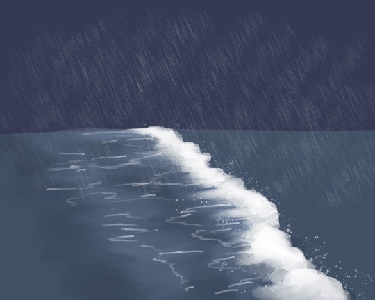
I recently found out about you and your selkie story! And two questions: can you do a tutorial of the rain and sea and did the girl cried 7 tears in the ocean to summon her selkie girlfriend like in the legends?
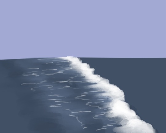
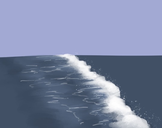
Alrighty I don’t often make tutorials so I will do my best here! (Working in Procreate for these shots)
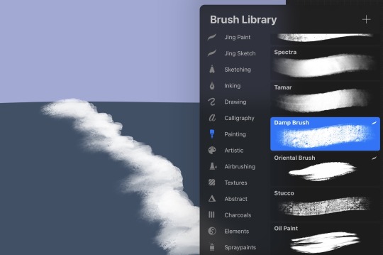
First I use a large solid brush to block in the water, and then I start the wave with any brush that has texture and variation in opacity. I tend to do a more solid block first, but not so solid that the foam will look unnatural, just enough to plan out the look and path of the wave. Then I use a similar or same brush on the smudge tool to both pull it out, away from the direction the wave is traveling, and also towards, again for variation. I don’t smudge the front of the wave to keep the look of sea foam being pushed towards the shore, I don’t want it too soft looking. Myself personally for stuff like this I really like the watercolor maxpack by Max Ulichney, but there’s plenty of great options in just default brushes. Anything that’s more painty looking, again, the textured brushes really help. Lots of options in the painting and artistic brush categories.
Next I add some smaller details, where the foam breaks up and disperses behind the path of the wave, as well as some variation in the color of the water, and blending it in to the solid base color to soften it. And then the spray where the foam is rolling and breaking, you can use any spray paint brush, or anything that looks like paint flecks! Rinse and repeat, giving some variation in size of the waves, as well as how “even” the flow of the water is. Like some parts of the same wave will reach shore before other parts, instead of hitting in one straight line.
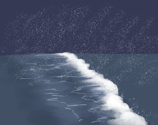
As for the rain, I believe when I did that comic I used the standard spray paint tool and then a motion blur. Not the most elegant looking rain but it’s easy and you don’t have to draw a ton of individual rain drops~
And as for your question on the story, I actually hadn’t been thinking of any kind of legends or established selkie lore! The unspoken part of the story is basically the selkie hears the crying of the girl on the pier and comes to investigate. She asks what’s wrong and the answer is kind of “everything,” and the selkie offers a change, that maybe ocean life would be better. And I don’t know if selkies can turn humans into selkies but I decided they can, enter the good old “sharing magic through a kiss” trope and hooray! Selkie girlfriends!
11 notes
·
View notes